How data visualisation helps in taking the right decisions?
Standard analytic systems such as Google Analytics, Microsoft Excel display report data by tabulating them. Such a layout works to display detailed information and milestones. Yet, tables cannot always reveal the legacy data and allow swift spotting of the most relevant data. We recommend that you use tools and instruments of data visualisation to arrange the information in the most convenient way. This blog article will tell how to develop a transparent report by applying the Power BI tool.
PROVIDED BY DATA VISUALISATION
Power BI allows to visualise data and make them more transparent. The interface of the Bower Bi tool is very convenient and intuitive for data modelling and visualization. The users who are accustomed to daily use of the Microsoft Excel tool will find it particularly clear and comprehensible.
This tool allows to connect various data sources by but one click. The system gallery provides numerous visualisation tools for various types of reports. Professionals can choose between a cloud-based solution or a desktop version.
EXAMPLES OF REPORTS WITH POWER BI TOOL
EXAMPLE NO. 1
Power BI un AND SALES RESULTS
Let us examine developing a transparent report on the basis of a business example. If we look at the tabulated data, it may seem that the performance is insufficient, all is bad, and somebody should say farewell to their long-awaited bonuses:
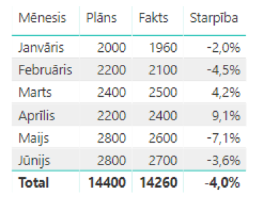
However, if the same data are displayed by means of the chart below where the bars represent the actual values, but the planned values are shown by the line diagram, it is apparent that the general development and the performance are not so poor:
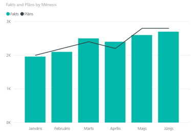
Yes, the performance is still catching up the plan, but the values are very close to the expected figures. The overall dynamics indicates the staff’s efforts to achieve the set target and depriving the employees of the bonuses would not be the best-ground decision.
EXAMPLE NO. 2
Power BI AND ASSESSMENT OF THE CUSTOMERS’ BEHAVIOUR
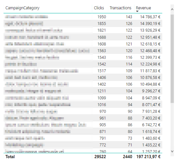
Let us address an example of another table that shows the clicks, performed transactions and turnover in various categories. We can sort the tabulated values by the turnover (from high to low). It is apparent and clear that the categories that are displayed in the upper part of the table result in better sale indices:
Let us transform the table into a bubble-chart! The X-axis represents the clicks, the Y-axis shows the transactions, the bubble size is the company’s profit, but the colour depicts the clusters or coherences found by PowerBI within the group. It shows right away that profit of the yellow cluster is significantly smaller even though the campaigns with the number of transactions brought by the campaigns with the higher number of clicks is similar to the number brought by the campaigns with the high level of turnover.
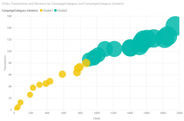
According to the table, the turnover shows a rather mild recession and relation between the transactions and clicks. However, the chart reveals that whole category of campaigns is highly ineffective in the terms of the ratio of the turnover, clicks and transactions. The beauty of Power BI becomes apparent when we click on any object, for instance, a cluster, and the changes are instantly visible in all the other visualisations on the screen.
EXAMPLE NO. 3
PowerBI AND FINANCIAL INDICATORS
Let’s take another example. This is how a table splits the turnover among the products: 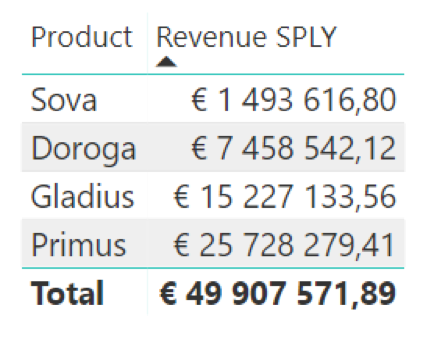 When using the same data by means of a chart, everything is obvious.
  The last bar – it is the total turnover. Whereas the first three bars represent the breakdown of turnover according to the categories said in the table above.
EXAMPLE NO. 4
Power BI AND MARKETING
The following table shows what keyword facilitate transaction in an advertising campaign. These data may be sorted based on the number of the performed transactions or the number of the closed sales cycles (diminishing): 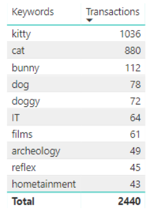 If a “tree” of categories is developed based on these data, it becomes clear in a quicker and more comprehensive manner that but 2 keywords ensure efficiency of the campaign, but the other words have minimum impact:
DATA UPLOAD IN THE POWER BI TOOL
It is not possible to upload online marketing data to the Power BI tool by means of the standard tools, which makes it a little difficult. For instance, you cannot extract or download non-sample data from the Google Analytics tool. There are adjusted solutions that allow connect the external sources to the Power Bi tool properly and correctly, still they will not build a data model and data visualisation model for you, and also will not establish any link between the promotion system clicks and session in the online analytics etc. It means that achievement of a result useful in business will take time and a precise vision of what you expect from such data visualisation as well as from the further use of it. The said download and upload services allow to address data analysis without delay and develop one’s own business-customised report in the Power BI tool. The services amass statistics from the advertising systems and online analytics on their own, link them among themselves and deliver them in a ready-to-use form to the Power BI tool for a perfect data presentation. When visualising data, it is crucial to consider WHAT you expect from the report and WHAT you want to focus at. For instance, it may be sufficient for a business manager to see the strategic indicators without any detail, whereas an advertising manager need build more detail reports with breakdown by various segments and by adding several variables. Power BI enables marketing professionals and sales professionals to visualise information and build transparent reports. Power BI helps analyse data in the convenient and comprehensible manner, track the dynamics of change, and assess significant indices.